Thursday, December 30, 2010

Better navigation options in Nautilus context menus

Am I the only one who is so used to the 'Right Click' + 'Back' option on Browsers that he keeps creating untitled folders everywhere in Nautilus?

Context menu in Nautilus 2.32.0
However, on a browser, it is the more convenient 'Back' option:

Context menu in Chrome (almost the same for Firefox and Internet Explorer too)

Volume of notification sounds in Empathy

I have been away from Gnome for too long, I guess. Until very recently, I was on the Awesome window manager but after upgrading to a new Harddrive (yes, I still upgrade my hardware old-skool way instead of buying something new), I though I'll give Gnome another look.

Also, I was feeling a little guilty about Ubuntu ditching Gnome for Unity.

While shifting, I also thought that I'll move my standard chatting program from Pidgin to Empathy, which seemed to be better integrated with Gnome. However, I had this constant problem of not getting any sound notifications when anyone pinged me (also because I keep playing music continuously in the background). The preferences did not give me an idea of what was wrong:

Wednesday, December 29, 2010

Rhizome 7/7 conference

On 16th April, 2010, seven leaders in Technology and seven leaders in Art were paired up and left for a day to develop something new. The results were shown the following day in the New Museum in Ney York. This was the Rhizome Seven on Seven conference. Here is a list of videos with a line of summary for each.

Monday, December 27, 2010

Bar charts with icons and most experimenting users

Showing icons instead of the boring colors in charts is an oft-used Infographics technique. I too used it to draw the lower part of a graph.

Now with the PictureBar class, making them in Processing is easy.  The output of the code is akin to this (the icons are only samples, can be substituted by your own icons):
Sample output of the PictureBar program

Sample output after some post processing

The program
The source code of the class is well documented but here are a few pointers as to how the code (in particular the draw() function) works:
  1. Given the number of icons to be present in a bar and the distance desired between bars, it determines the width of bars:
    • This also fixes the icon size because we know the number of icons to put at each level
  2. Select the bar which has the maximum value and determine how many rows of icons will fit in the provided height (the entire height is used)
  3. Decide how many icons to put in the last row of the bar with maximum value:
    • The total number of icons in this bar will determine the value (in percentage) of each icon
    • Decision is based on what number minimizes the desired and represented percentages across bars.
  4. The bars are drawn using the given number of icons either from top to bottom or from bottom to top (default)
    • However, the rows are always filled from left to right.

Example usage of this class is given in the picturebars.pde file. As I am learning Processing as well as playing with the Mozilla Test Pilot data, this is the result of combining both together (and then post processing the output with Gimp).

A word about the data
The data used here is the user survey conducted as part of the Test Pilot suite. The survey was optional and a total of 4,081 users answered it. Out of these, 3361 users used Firefox as their primary browser or used only Firefox and 279 people either did not answer this question or marked other. The chart here shows the distribution of these pagan beta testers. The exact numbers are given to the right of the graph.

Digging a little deeper
Though the graphics shown here is only for demonstrative purposes, after some analysis there is one interesting observation which can be made.

We know already that the user share of different browsers (as on 27th December 2010) is approximately:

  1. Internet Explorer: 46 % of users
  2. Firefox: 30 % of users
  3. Chrome: 12 % of users
  4. Safari: 6 % of users
  5. Opera: 2 % of users
  6. Mobile browsers (others): 4 %
This safely can be taken to be the prior distribution of web users. This means that an average user (about whose browser preference we know nothing) will be an IE user with 46% probability, a Firefox user with 30 % probability, etc. Further, if we know that they are not Firefox users (that is, have honestly marked on the survey they voluntarily submitted that Firefox is not their primary browser), then using Bayes' rule the probability of being in each class is jacked up by 1/(1 - 0.3) or by about 1.43:
  1. 65 % users should be of IE
  2. 17 % users should be of Chrome
  3. 9 % users should be Safari users
  4. 3 % users should be Opera users
By these estimates, those 441 users who are Beta testing Firefox should have been thusly divided:
  1. 286 IE users instead of 114
  2. 75 Chrome users instead of 243 (!)
  3. 37 Safari users (Bang on!)
  4. 13 Opera users instead of 47
Now before we conclude anything from here, 441 is not a large number and the 279 people who did not answer this question (or gave other as an answer) could have completely changed our outlook.

With this pinch of salt, there are some interesting hypothesis which can be formed, keeping in mind that these users were beta testing Firefox:
  1. IE users either love their browser very much, or they do not experiment a lot
  2. Chrome and Opera users love to experiment with other browsers (Firefox)
Of course, one can make lofty claims about the attrition rates of other browsers, but I do not think that the data is sufficient to conclude that.

Any way to test these?

Appendix
  1. All logos are taken from the respective Wikipedia entries of the browsers. 
  2. Large Firefox logo taken from here.
  3. All graphics shared under Creative Commons Attribution-ShareAlike 3.0 license
Also interesting:

Thursday, December 16, 2010

How long will your browser session last?

Browser sessions

This is a follow up from my last post and the analysis takes a different direction in the next post, where I talk about someone beta testers who are not Firefox users.

First a short recap:
  1. Extracted the BROWSER_STARTUP and BROWSER_SHUTDOWN events from this data set.
  2. Sorted them by user_ids and then timestamps.
  3. Preserved only alternating startup/shutdown events for each user.
    • Discarded about 10% of the data here (578,496 entries remained)
  4. Ignoring the user, found out the distribution of the session times and plotted it.
  5. Was surprised.
Unterminated sessions

One of the concerns was that it might be the case that the longer browser sessions were still 'on' when the study period ended.  There were only about 10,000 browser session open at the week end, which is less than 2% of the total browser sessions in the data set. Hence, the long lasting browser sessions would not have effected the end results much.

User sessions

Also, it is clear (actually, only in hindsight) that the users who open their browser only for short periods, will open it often in a given fixed period. This is a classical problem of Palm Calculus. As we are looking at time limited data (1 week long), the shorter browser sessions have a greater propensity to occur. However, this does not invalidate the previous results: from the browser's point of view, it will still be closed in under 15 minutes 50% of the time.

Browser's point of view of session times


Or, when stated more aesthetically:
Firefox session time distribution

However, from the User's point of view, the scenario is a little different. Upon looking at the average length of Browser sessions by each user (more than 25,000 users have at least one open/close event pair and 95% have more than 2 such events), it clearly stands out that the number of people who have average time from 15 sec to 15 minutes is not very high:
Number of users who have the given average session time (log scale)

Note that the graph ticks are not aligned to the bin divisions.

Difference

Hence, this visualization which makes clear the difference between how many users experience an average session length and how many times does a browser experience a given session length:
The distribution of users and Firefox sessions against their distribution times.
This is close to what will be my final entry to the Mozilla Open Data Visualization Competition.

Update:


I did not like in the cramped feel of the objects on the graph, so I sacrificed some accuracy (the 5% and 3% bars are the same length in pixels now, but on the other hand, they do not even have error bars).

Hence, I condensed the graphs, changed a little text and decided to go with this:

The data is the same, but the Firefox bar lengths and the User bar lengths are comparable in size now. Even though comparing them does not make any sense, but it is slightly better to have the percentage sizes nearly equal, I think.

Conclusion


So what can we take away from this? The next improvement which Firefox should aim at. Consider the following feature from the two different point of views:

  1. If for only 10% users the average Firefox utilization is less then 15 minutes, and Firefox takes 5 seconds less to start, would it make a difference?
  2. If 45% of the time Firefox is opened and closed in a span of 15 seconds to 15 minutes, would shaving 5 seconds off the startup times make a difference?
Should the priority be more satisfied users or better software?
Which feature / improvements will appeal to users more and which are minor updates? 
Which ones should you advertise?
Which point of view should the development team take? 

This is just one trade-off, there might be more trade-offs involved in making long term uses/users better than the short term users/users. The information of how the scenario looks like from the user's and the browser's point of view would certainly help in making these decisions and deciding when the feature is a killer one.

Update: The visualization, along with several other excellent entries, is featured here: https://testpilot.mozillalabs.com/testcases/datacompetition

~
musically_ut

Epilogue:
  1. Test pilot Visualization taken from here, designed by mart3ll
  2. Mozilla Logo from here.
  3. All graphics shared under Creative Commons Attribution-ShareAlike 3.0 license

Sunday, December 12, 2010

Are Firefox sessions are really this short?

I have been meaning to play with the Test pilot data for quite a while now. The primary problem was, err ..., my Harddisk space.

Anyhow, I got the data downloaded finally, only to see that my computer's memory was the next bottleneck. Things looked hopeless till I started looking at it as an exercise in online algorithms.

Then I saw one thin silver lining: the data in the csv file was presorted by the user_ids.

There was my window! If I could pre-segment the data based on the user-ids, then I could run though one user at a time, instead of reading all the data. Though not much, but linear grouping of the users already saved me a lot of effort. My next hope was that after ordering by the user ids, the data would be ordered by timestamps. Sadly it wasn't, but one cannot have everything in life anyway. :-)


  • Extracting the data

After a quick perl script to confirm the ordering of user_ids, I wrote a script to calculate the time intervals between a BROWSER_STARTUP event and a BROWSER_SHUTDOWN event in the data. There were various instances when the BROWSER_STARTUP event was present without a BROWSER_SHUTDOWN event. Probably the browser was started when the system was online (most uses of Firefox are online, after all) but the system was not online when the browser was shutdown (or crashed). So, I skipped all the orphaned start-up events. Also, some startup-events might also be made while the host was offline, and ignoring these would bias the intervals towards being longer.  I cleaned up the data (there were a few instances ~ 10s when the session lasted beyond 7 days?) and I plotted the intervals (on a semi-log scale) in R.


Now I am a user who generally carries his laptop around and has his browser open almost all the time. I was in for a small surprise, enough to make me go over the code twice before I realized that the code was correct and my intuition was wrong.

  • Visualizing the data

This data extraction took a whopping 30 minutes on my meager laptop. The stats are here (all numerical values in milliseconds):


Maximum interval = 534616265 ms  (6 days)
Minimum interval = 31 ms
Mean = 4286667.42334182 ms (1.1 hours)
Median = 896310ms (15 minutes!)
Skipped 54748 out of 633212 BROWSER_STARTS


50% sessions were less than 15 minutes long, and this is while the intervals are biased to be longer!


Of course, there are some very long periods, which pull the mean up to 1 hour, but considering that there might be outliers in the data, median is a far more robust measure. In case it is not apparent, this is a beautiful log-normal distribution staring one in the face.

It took me a while to imagine that most operations with a browser end rather quickly for most people, they do not live their lives in a browser. In other words, I am an outlier here!


How long do Firefox sessions last?

  • Conclusion

I am sure most people at Mozilla know this and, if this is indeed correct, they probably are making sure that Firefox is well suited for short operations and not extended week long uses. I am not sure whether these are competing demands, perhaps making the start-up quicker, pre-indexing search files, etc. also help in extended sessions. However, it appears (with more than just a pinch of salt) that Firefox should focus on the quick-draw and fire users for gaining market in the short term, at least. This is taking the exact opposite direction of Chrome's development, by the way.

However, there are alternate explanations possible. I am not sure how many of these were voluntary terminations; it might be that these are regular restarts. Or it might be an indication of a bigger problem, as this comment indicates:  frequent cold-restarts forced by the user to reduce the memory footprint of the browser. Or it might be that people are using Firefox only as a compatibility browser, when something (like Java applets, or broken Javascript code for example) does not work correctly on other browsers, they fire up Firefox, do the task and return back. This last question can be answered using the Survey data.

Will keep digging and hoping to find something interesting.

Feedback welcome.

Update: A few more important factors are:

  1. What were the average session times per user?
  2. How many Browser sessions were still open when the week ended?
These concerns will be addressed in the newer post.
These have been addressed in this post.


~
musically_ut

Saturday, December 11, 2010

Anatomy of my first Processing program

I recently had my first go with the Processing programming language. Inspired by J David Eisenberg's tutorial on Anatomy of a Program, I will explain here how I got started with Processing.

To give an idea of what all this work is about, have a look at a video of the output (generating which is also a part of the program). I had asked a bunch of my friends (we call ourselves the Pikeys) about how much it cost them to live in their cities. I made this video for both the purpose of learning Processing, as well as to see the information myself:


Now instead of simply explaining the final code, I will try to explain the various steps the program went through, including some crummy parts which other tutorials generally skip. I had zero (rather negative) experience with programming graphics myself (in C/C++) and had more or less given up on it before trying out Processing. Also, I do not consider myself a designer per se. Hence, I probably bumped a lot more often into problems which perhaps only a newbie would appreciate. That is exactly who I would like to help!

Initial Idea


After seeing the FireCube example and the rotating world map, I knew that their was exactly what I wanted: A flame on each city with the intensity of the flames indicating how big a hole living there would burn in your pocket. Now all I had to do was somehow do it.

After putting off the execution for about a month, I finally started with the project in the earnest with this:

Was not sure how to say hello world.

Yes, that's right: a good 640 x 480 sized screen. That's a start.

Also, the first lines I code I wrote are expressible in less than 140 characters. All the screen shots which follow were taken by just pressing 's' while the program was running. Since my efforts continued for more than just one day, I augmented the trick a little:


void keyPressed() {
   if (key == 's')
    save( "screen_shots/" +
      year() + "_" +
      month() + "_" +
      day() + "_" +
      hour() + "_" +
      minute() + "_" +
      second() + ".png");
  }


Adding day, month and year details too.

Finding a world map.


Of course, the most obvious place to look at is Wikimedia's blank map page. I found a blank map which suited me and a couple of lines later, the map was there:
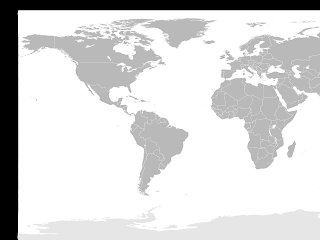
World Map
It was a little out of place, because of some transparent border which Wikipedia had added to the png, and a little off size too. However, cropping the bottom (sorry Antarctica) using Gimp and figuring out resizing options in image() was the easy part.

I knew at this point that the I would probably need to resize my canvas (not the image) depending on the end result. Hence, to locate the cities, I decided to go with the relative co-ordinates, which would be multiplied with the width/height of the canvas to get the (x,y) co-ordinates:


void mousePressed() {
  println("(" + mouseX/float(width) + "," + mouseY/float(height) + ")");
}


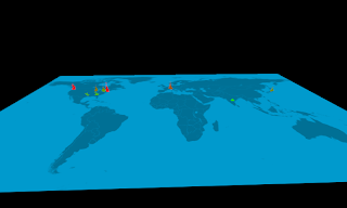
Then getting the location of the cities was as easy as clicking on the approximate location of the city on the map. Also, as I knew the cost of living in the city (I had some of my friends answer this survey), I made a linear interpolation between the green and red depending on the city costs and plotting ellipses at those points, I ended up with this (blue tint added to make the colors stand out):
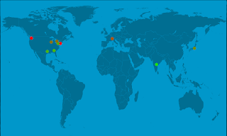
Cities with approximate cost of living in them

Rotating the map


Now begins the fun part. So far, I did not particularly need Processing to do the task, I might as well have done it with Gimp. However, I wanted to get some action in. The easiest way to go about it seemed to me to include the P3D option in the call to size() function and then rotating the camera around.


size(800, 480, P3D);
...
...

  float center_x = width/2;
  float center_y = height/2;
  float center_z = 0.0;
  float eye_x = 400 * cos(angle * PI / 180) + center_x;
  float eye_y = 400 * sin(angle * PI / 180) + center_y;
  float eye_z = 200.0;
  camera(
    eye_x, eye_y, eye_z,
    center_x, center_y, center_z,
    0.0, 1.0, 0.0); // upX, upY, upZ


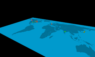
However, the results were a little off:

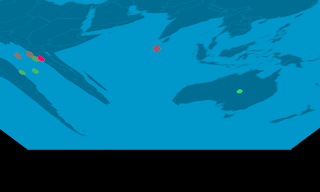
Image rotation with P3D

I realized that calling smooth() in setup() was necessary to get the cities in the right places:

World map with smooth() and P3D

However, there still were two issues here:
  1. There was diagonal line right across the image
  2. The ellipses kept flickering (As this is only a snap-shot, the flickering is not clear, but it is easy to perceive that the ellipses were only partially visible)
  3. The rotation was not at all like I had imagined.
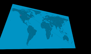
At this point, I turned to the excellent Processing forum for help. The fixes were:
  1. Using OPENGL instead of P3D (due to some bugs in processing)
  2. Drawing the ellipses 'one' pixel above the image in the z-direction.
  3. To orient the rotation correctly, I had to set the camera direction up direction to (0.0, 0.0, -1.0).
That fixed the graphics issues at least. 


Making the flames


I continued with trying to make flames. The first steps were converting the 2D animation of Firecube example to 3D. More about the conversion some other time, but it was not a very difficult. However, the end result was not as I had hoped:

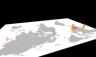
Flames on the world map
The intensity of the flames at the bottom was decided by the cost of living in the city and the flame was drawn pixel by pixel. Also, it was incredibly slow. So I instead decided to draw flames using ellipses myself. For each frame, I was drawing ellipses with center at the city, with some noise added. For each ellipse in the z-directino, I was reducing the radius and increasing the transparency to give a fade-out effect. The height was also proportional to the cost of living in the city.

Wobbling ellipses which faded out to give the impression of a flame

There were a few problems here:
  1. The random ellipses did not look like flames at all. They looked like wobbling tower of hanoi instead.
  2. The transparent ellipses drawn in the front made the back ground image visible instead of the flame (see the green flame over Texas and Madison).
Fixing the first issue (is it a bug?) simply required minimizing the overlap among flames. :-)
To fix the second issue, I started making the ellipses slide up preserving their centers and fading out, instead of giving them a wobbling effect, changing their centers. Though this is not visible in the snapshots, the final effect looks much more like smoke rising from the flames:

Final version

Final version


 Getting the video output


It turned out to be much easier than I had thought, thanks to the abundant processing libraries. Though I suppose it is possible just as easily using the bundled Video library, I decided to go with the GSvideo, which offered the same interface with a much wider codec range (including ogg). After initializing the object, adding support for recording was incredibly simple:

 void keyPressed() {

  // Learnt this trick from @blprnt, save a screen shot when 's' key is pressed.
   if (key == 's')
    save( "screen_shots/" +
      year() + "_" +
      month() + "_" +
      day() + "_" +
      hour() + "_" +
      minute() + "_" +
      second() + ".png");
  if(key == ' ' && !recording) {
    String video_file_name = "videos/" + year() + "_" + month() + "_" + day() + "_" + hour() + "_" + minute() + "_" + second() + ".avi";
    // Save as XVID in a AVI file with BEST quality:
    mm = new GSMovieMaker(this, width, height, video_file_name, GSMovieMaker.XVID, GSMovieMaker.BEST, fps);
    mm.start();
    recording = true;
  } else if (key == ' ' && recording) {
    mm.finish();
    exit();
  }
}


void draw(){
  ....
  if(recording) {
    loadPixels();
    mm.addFrame(pixels);
  }
}
That's it!

Final words


Of course, there were many other 'fix-this-and-that' moments during the code writing which I have not document here. Changing a color here, checking out different coloring schemes there, adjusting sizes of things, resizing the image to death, etc. are a few of these examples. I had to set the line somewhere.

Also, I have avoided talking as much as I could about the code, which is here. I hope, nevertheless, that I succeeded in giving an impression of how the development of the idea went, from a blank grey screen to a 3D world map set on motley flames. Also, I hope that I made it sound easy, because it really is!

Overall, I was satisfied with the project and I intend to return to Processing to do more serious visualizations soon. I hope you do too!

~
musically_ut